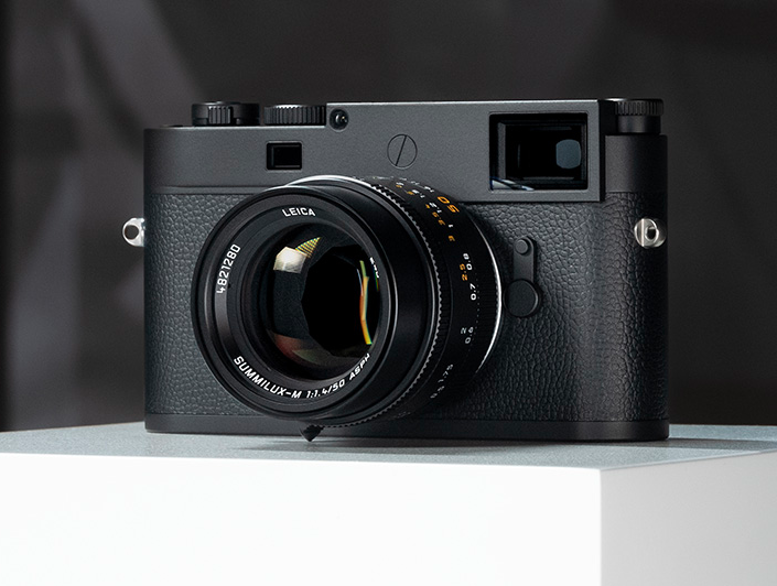
New M11 Monochrom Review
Introduction
Normally one expects around a 5-year product cycle from Leica, but It's only just over 3 years since the release of the M10 Monochrom and only just over a year since the release of the M11 itself.
Leica has decided that the Monochrom is important enough to bring it further forward in the product cycle, which is no surprise when you realise how popular the previous Monochrom cameras have been.
Next month it will be 11 years since the original (and still much loved) CCD based M9 Monochrom was announced, at the time it seemed to be an incredibly brave and risky venture, but it proved to be a great success (I still have mine and use it occasionally).
I've spent a little over 8 months with the new camera, which has given me time to really get to know it. Unfortunately I did not have an M10M to compare it with, but I can't imagine that image quality differences between the two alone are likely to be the reason for an upgrade. There are, however many other good reasons!
First of all I'm going to look at the differences between the M11M and the M10M with respect to hardware and firmware, this was well covered in my M11 review last year, but I think it's worth revisiting as it's easy to forget what a big upgrade the M11 actually is, and some things have become clearer (and improved) over the last year.
After that I'll look at some comparisons with the M11 itself to try and get a handle on the advantages of the Monochrom over it's colour sibling. I will be examining detail and high ISO performance together with a quick look at colour response (including a short comparison to the original M9 Monochrom).
Finally, I'll have a look at the changes in FOTOS which make it so much more satisfying to use with the M11 cameras.
Hardware Changes from M10M
Lets start by looking at what Leica have changed with the M11 (and there is a lot!).
The Body
Superficially the M11M looks very much like the M10M, the dimensions are identical and everything appears to be in the same place. However a closer examination shows a lot of differences.
First of all, there is no base plate. This has proved quite an emotional issue for lots of M users - indeed some have not upgraded to the M11 because of it.
The base of the M11M holds a battery (and battery release switch which is the same design as that on the SL2 and Q2 cameras). The battery however is different. more about that later.
New Button layout
The M11M has 3 buttons to the left of the LCD like the M10M, but they have been changed to Play / Fn / Menu options like the SL2 and the Q2, The Fn key defaults to turning on and off Live View, but it can be configured to any other function as desired.
The rear plate has been tidied up a bit - the buttons are now separate from the LCD, and the LCD is flush with the top plate and base of the camera.
The front configureable button on the M10 has gone, but there is a new button on the top plate (in the position of the Video button on the M(240). Like the Fn (above) this button can be configured to default to any particular menu option (I have it set to magnification like the old front button on the M10).
To continue reading Jono Slack’s review, click here!


