Punch it Up!
Adding oomph to basic images:
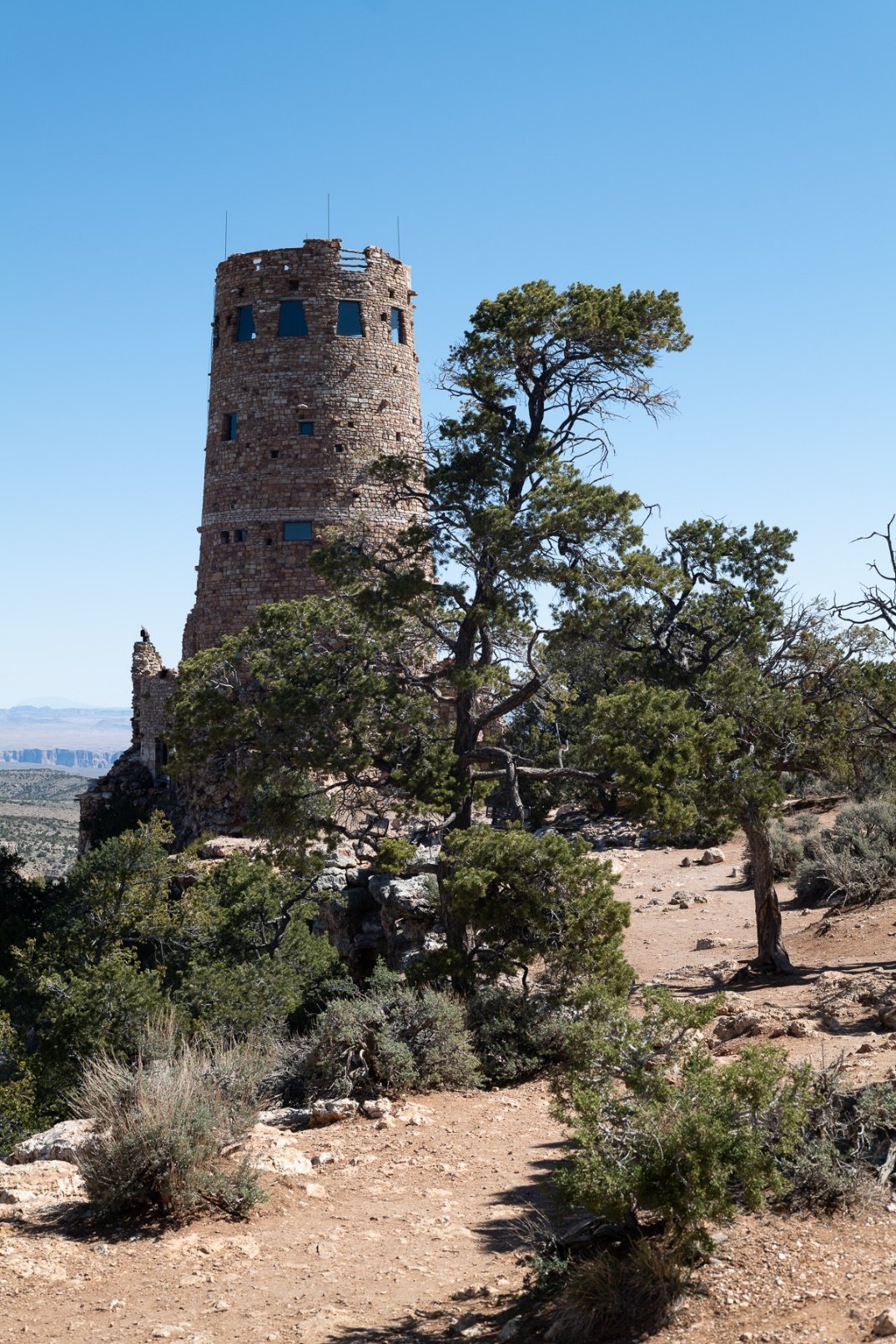
Tower (before)
As good as Leica cameras are, they can produce dull images for some subjects, in need of editing to make them more appealing. The first image below is a rather dull, unedited version of what could be a very nice scene, taken of the Desert View Watchtower at the east end of the Grand Canyon National Park. I used an SL2 with a 50mm Summicron M (version V). Shadows lack some detail, the sky is less blue than I remember when the image was made, the saturation could be better and the detail in the tower could be better.
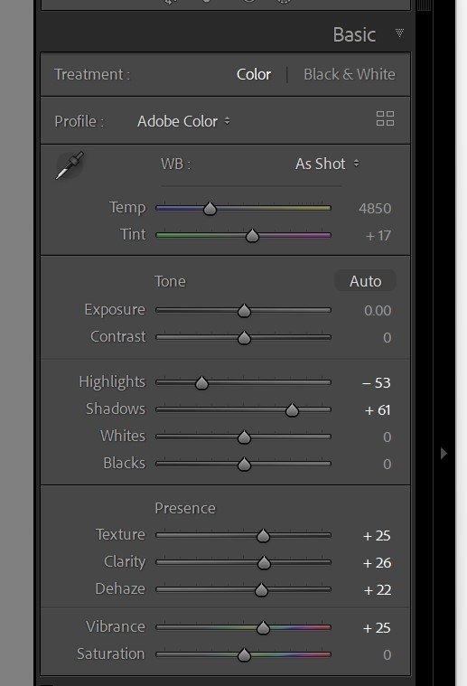
Lightroom settings….
To add some “punch” to this image, I developed the following set of image adjustments in Lightroom and created a preset so that I can automatically apply these settings when I import the image. In addition to the settings in the basic panel (shown) I also darken the blue luminance slightly in the HSL panel, making the blue sky a bit darker and more appealing.
It is useful to point out that I reserve changes to the other adjustments until I see the image and can apply changes specific to the image itself. That also applies to the Transform panel. For Photoshop users, note that these settings are also nearly identical in Adobe Camera Raw.
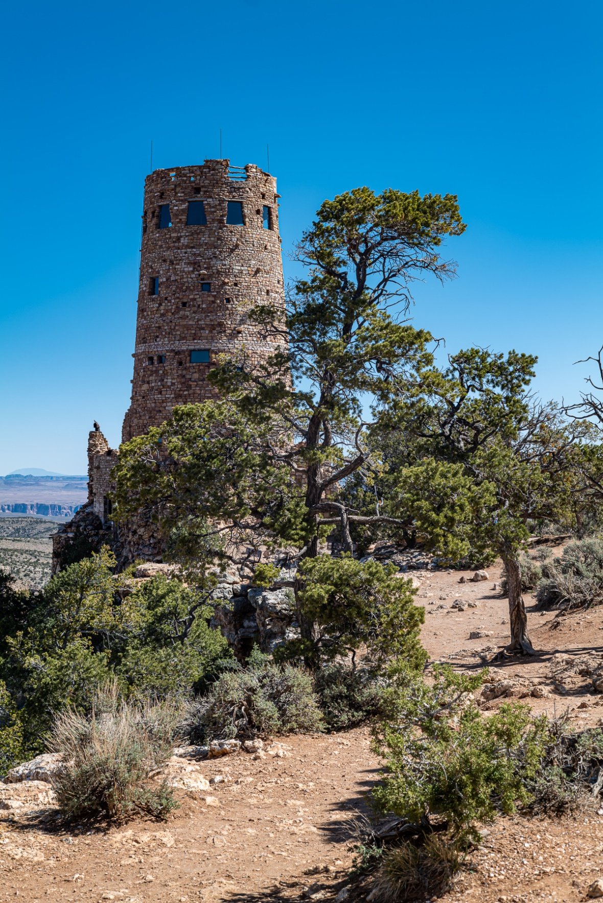
tower (after)
The result of these adjustments is here. Once you have applied the preset you created, feel free to tweak them and add other adjustments as needed.


